KS Health Institute Report
Project: Report Redesign
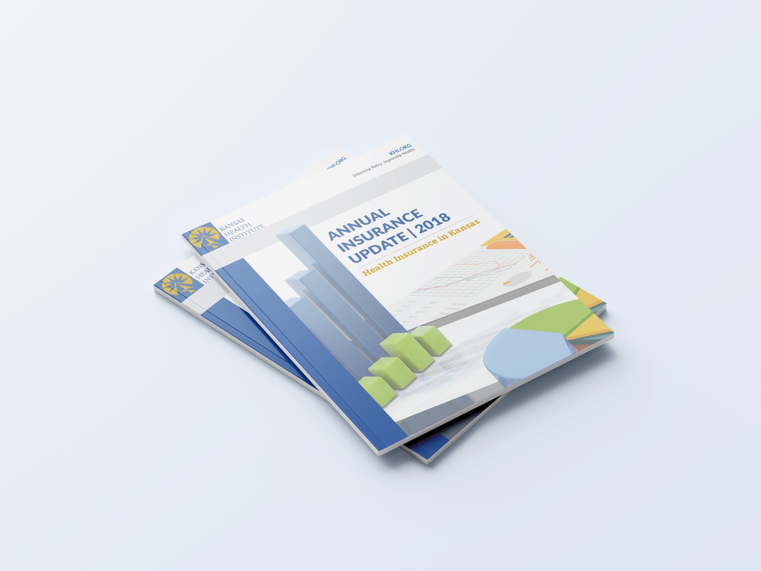
Purpose: Update design of brochure to be more compelling with information presented in a clear and consise way.
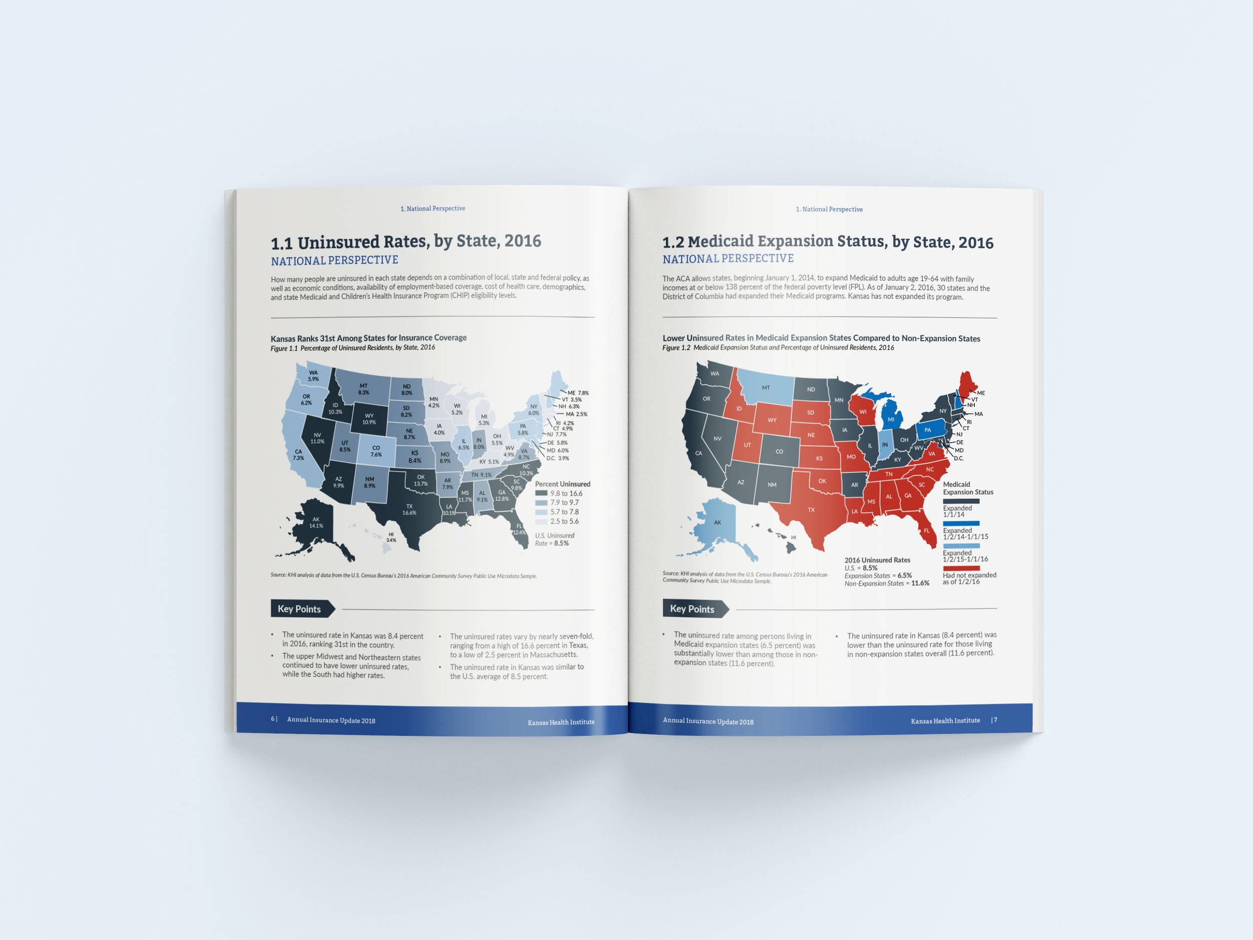
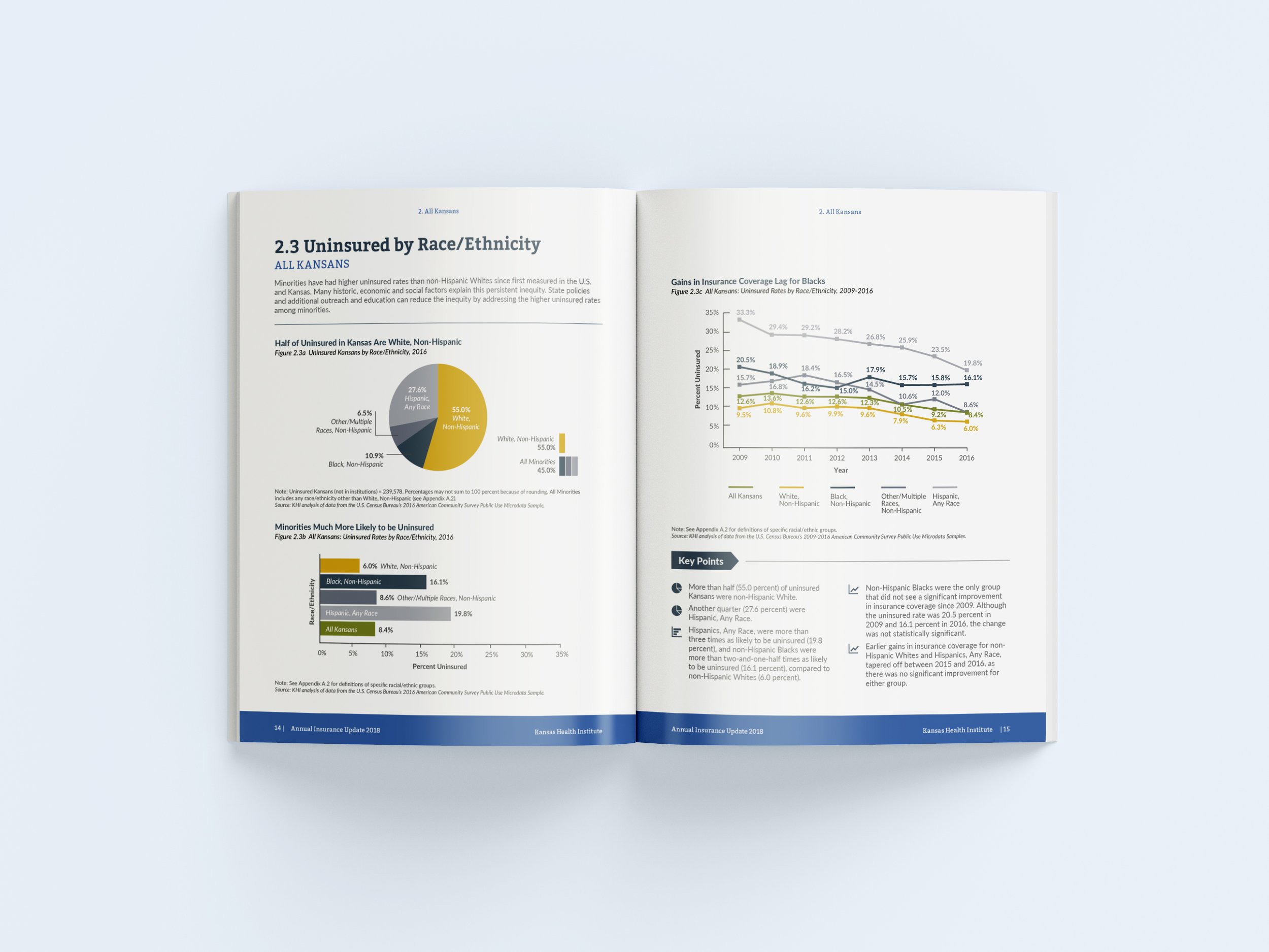
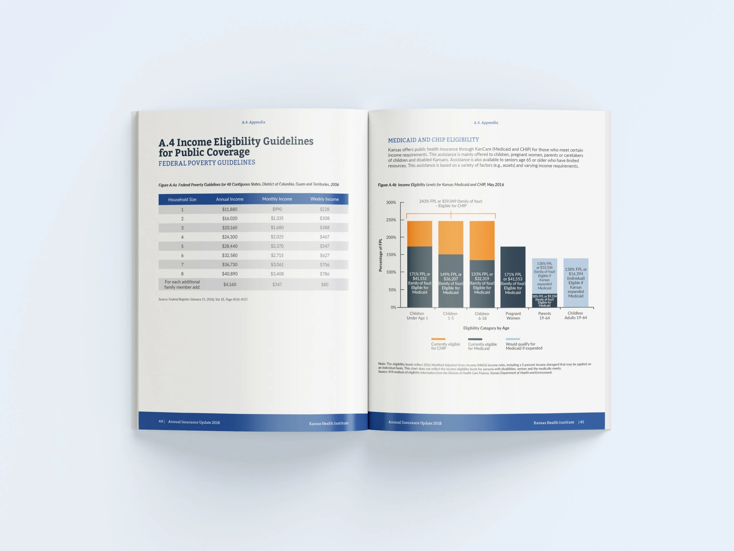
Process: Using the existing brand, I designed a brochure that emphasized color, white space, and clear and simple graphs. This helped the dense information be laid out in a way that was easy to read and understand. Interpretting the data and determining what graph style would work best, allowed for simplified reading and effective interpreation of all the data. I then created a hierarchy of color so that each graph would have contrast and balance, and designed icons that represented each graph so that it better connected key points to the data being shown.


