HAMM Companies
Project: Branding & Collateral
Purpose: Update the brand from its original look into something that was modern and could stand up against their competitors.
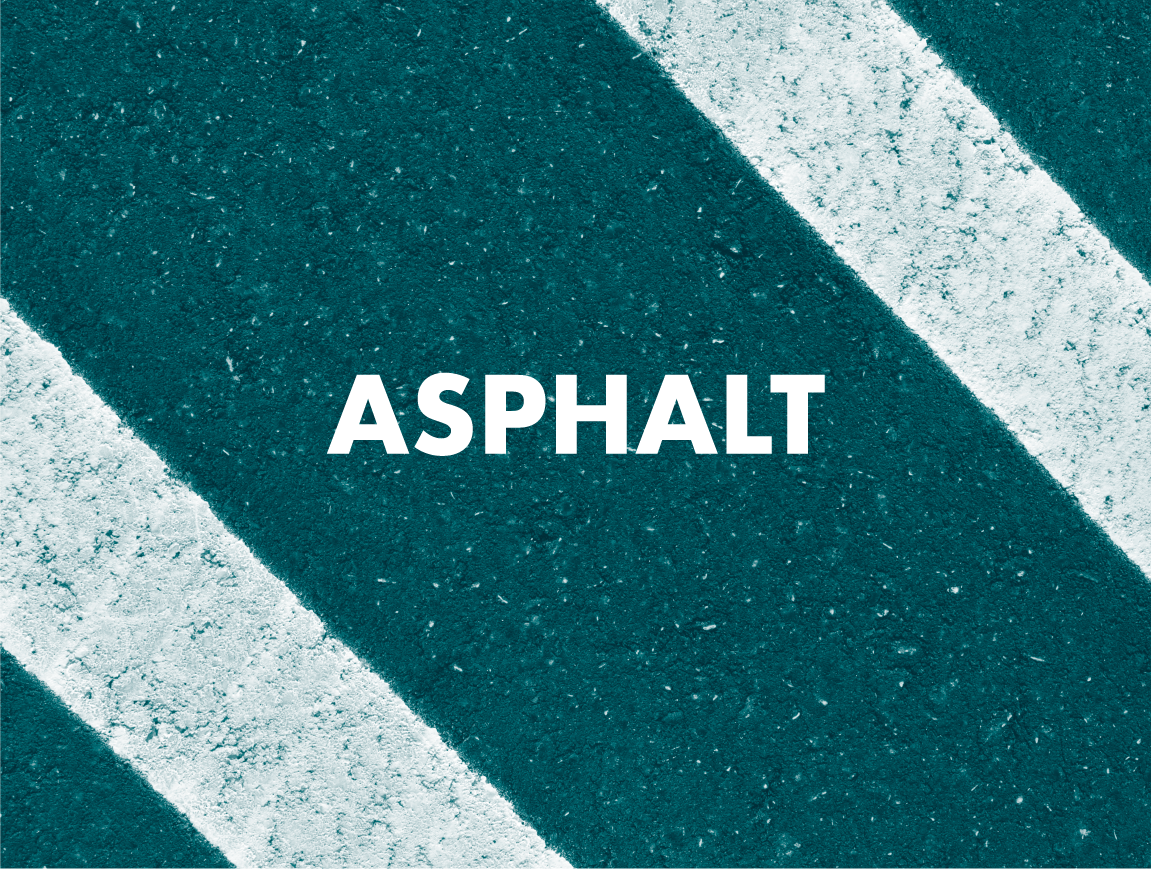
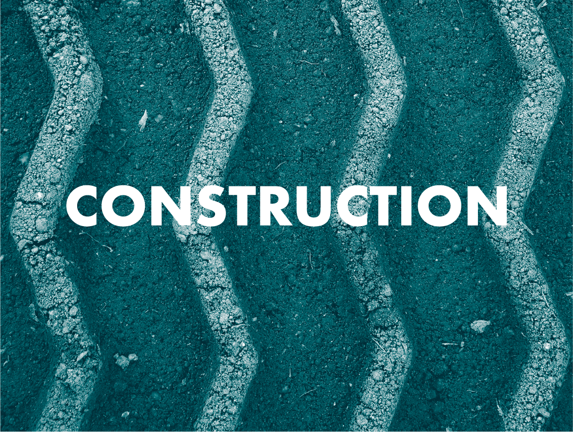
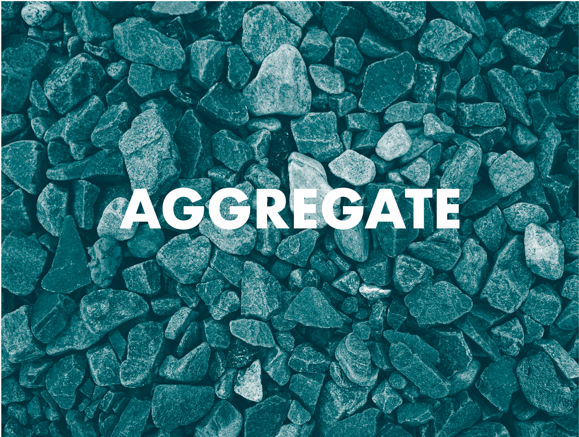
Process: HAMM had an existing history in the area, so I built on that in order to modernize their brand and not lose any established brand connections. They had a bright aqua, PMS 320, as their brand color and because that was unique in the construction industry, I kept it and leaned into it. Featuring this color,, as well as making minimal changes to their logo, helped to modernize the brand without changing the overall look. They wanted to start featuring their different service lines as well, and because their service lines revolved around tactile elements, I created stylized photo textures as the featured image for each area, i.e. Aggregates, Asphalt, Ready Mix, etc. All of these combined created a more relevant company that could partner and support the modern customer.


Credit: Sprout Creative


